Visual Hierarchy and Composition
The Role of Layout in User Engagement
A visitor forms a verdict about your website in roughly 50 milliseconds. That is faster than a blink. Layout determines that verdict. When visual hierarchy leads the eye naturally from headline to action, engagement follows. When elements compete for attention, users bounce.
In graphic web design, composition is the quiet structure beneath every successful page. Size, contrast, and alignment assign weight to each element. The most important message should dominate the viewport. Supporting details earn their place through spacing and rhythm.
Strong layouts tend to share a few traits:
- One clear focal point per screen
- White space that separates ideas without wasting them
- Alignment that mirrors how South African users scan on mobile
I have watched local businesses lose customers because their layouts ignored these basics. Good graphic web design does not decorate. It directs attention. That direction is what keeps a visitor reading, scrolling, and eventually acting.
Balancing Focal Points and Negative Space
Every element on a viewport demands a decision from the eye. The designer settles that question through hierarchy. Visual hierarchy assigns relative weight through size, contrast, and placement. In graphic web design, the focal point should carry the strongest presence. Negative space allows that presence to register. It is deliberate distance between the essential and the incidental.
I have audited local business sites where the failure was equal treatment, not weak aesthetics. Everything was loud. Nothing led. The user’s eye wandered until it gave up.
Several principles govern this balance:
The primary message carries the strongest contrast on the page.
Its edges remain protected by generous white space.
Secondary elements recede through scale or colour density.
Graphic web design succeeds when the essential element commands the viewport and the rest steps aside. That discipline separates a composition that directs attention from one that merely decorates it.
Typography as a Visual Anchor
In graphic web design, typography anchors the composition before a single image loads. A bold headline positions the viewer. A restrained body font keeps them reading. The hierarchy of a page is set by its letterforms, not its pictures.
Size, weight, and spacing signal importance. Dense, large type commands the viewport. Lighter weights let the eye rest.
I have seen pages fail when every type element carried equal weight! The structure of type shapes the composition:
- The headline establishes the anchor point.
- The subheading bridges the headline and the detail.
- The body text carries the reader through the page.
That sequence is visual hierarchy at work.
Using Color Psychology to Guide Attention
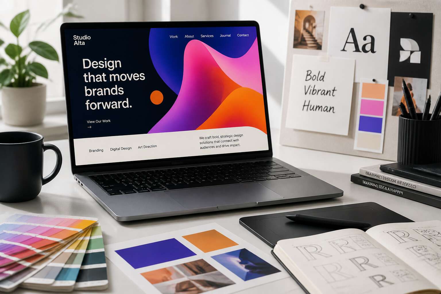
Color arrives with its own agenda, often before the user knows why their eye has moved. In graphic web design, hue is not decoration. It is a quiet director. The sharpest composition loses its edge when color signals contradict the layout. Your eye follows luminance first, saturation second, and meaning third.
A muted palette can push a secondary element backwards, while a single bright swatch drags the attention forward. This is the dance. The pyramid of your page, built through size and space, becomes a conversation with the viewer’s instinct. They will look at the bold block of vermilion before they read the smaller, quiet text beside it. That is not a failure of your hierarchy. It is a fact of perception.
- Dark, heavy backgrounds pull focus inward.
- Cool tones, like blues and greys, recede without apology.
- Warm accents, amber or coral, act as a lure.
- Restrained color allows type to rule the page.
The danger lies in complexity. Too many competing tones fracture the progression you worked so hard to establish. A header in electric orange, a paragraph in forest green, and a call to action in royal blue fight each other for the same territory. Your structure collapses. The reader feels it as noise.
Instead, let contrast do the heavy lifting. A single vivid element on a landscape of neutral tones will claim its space without shouting. This is how the eye travels from the headline, through the body, to the button. The palette becomes a map, and the composition follows its contours. In graphic web design, color is the shadow that gives the form its depth. Use it like a whisper, or use it like a weight, but never let it roam free.
The Intersection of Brand Identity and Digital Interfaces
Translating Brand Values into Visual Elements
Brand identity changes the moment it meets a screen. A logo may hold its shape, but its weight, texture, and rhythm shift entirely inside a browser viewport. South Africans increasingly interact with businesses through mobile interfaces, and this changes how a company’s founding story translates to the screen. Johannesburg startups, Cape Town retailers, and Durban nonprofits all face the same challenge. I find this tension fascinating. Graphic web design demands a deliberate translation of values into tangible cues. Those cues must survive the constraints of bandwidth, screen size, and attention spans. Consider the visual vocabulary:
- Iconography that matches the founder’s original sketches
- Photography direction that reflects local landscapes
- Motion sequences that follow the brand’s verbal tone
Each element communicates intent. When these pieces align, users sense a coherent personality without needing to articulate it. That is the quiet work of strong graphic web design!
Consistency Across Breakpoints
A brand’s visual weight shifts unpredictably when the layout moves from desktop to mobile. In South Africa, mobile traffic dominates, so that shift demands constant vigilance. Consistency across breakpoints is a discipline of restraint, not a technical afterthought.
The logo shrinks, but its presence must not. Navigation condenses, yet the tone remains. Graphic web design succeeds when the user forgets they switched devices. This requires auditing each component at every viewport width. The elements that carry identity include:
- imagery crops that preserve local context
- button shapes that keep their tactile weight
- motion timing that matches the brand’s verbal rhythm
- white space ratios that protect visual calm
A persistent visual rhythm builds trust. A broken one sends visitors back to search results. The best graphic web design keeps the brand’s core visual signals intact across every screen size.
Creating a Cohesive Visual Language
Your brand’s identity is not a logo file. It is the sum of every decision your digital interface makes. Graphic web design turns those decisions into a cohesive visual language. A South African user perceives trust through the texture of a button, the cadence of a loading spinner, and the personality of an empty state. I have watched brands lose that trust in the time it takes a page to load.
A cohesive visual language emerges when the interface behaves with the same temperament as the brand. Auditing the quiet components matters as much as the hero section. Consider:
- Iconography style that echoes your brand’s cultural register
- Microcopy that speaks with the brand’s verbal accent
- Interaction states that respond with the brand’s emotional pace
When these elements align, the interface feels coherent. When they clash, the visitor leaves. Graphic web design ensures the brand presents a coherent message across digital touchpoints.
Iconography and Imagery Selection
A visitor forms a first impression of your brand in milliseconds, often before reading a single word. That impression is built through imagery and iconography. These visual elements carry the weight of your brand’s personality, translating abstract values into something the eye can grasp immediately. A photograph of a busy Johannesburg street tells a different story than a minimalist illustration of the same scene. The selection of these visuals is a strategic decision, not a decorative afterthought.
The images you choose create a visual identity architecture. They must share a consistent treatment, a similar lighting style, and a coherent colour grade. When a user scrolls from a hero image to a product shot, the transition should feel seamless. Iconography follows the same rule. A set of rounded, playful icons will clash with sharp, corporate photography. The details matter.
The quiet components of an interface, the empty states, the loading icons, and the form labels, rely on imagery to feel intentional. A well-chosen illustration in an empty cart can soften a moment of friction. A generic stock photo of a handshake does the opposite. Every image is a chance to reinforce the brand’s temperament.
- Icon sets should match the line weight and corner radius of your logo.
- Photography should feature a consistent colour palette and subject perspective.
- Illustrations should adopt the same cultural references as your brand voice.
Graphic web design is the discipline that brings these choices together. It creates a system where every visual element speaks with the same accent, making the digital experience feel authored rather than assembled. When the imagery is considered, the interface earns a measure of trust that text alone cannot provide.
Performance-Driven Aesthetic Choices
Accessibility in Visual Design
In South Africa, where mobile data costs remain a genuine barrier, every kilobyte counts. A graphic web design that ignores performance penalises users before they even view the content. Large background images, custom fonts, and complex animations all carry a weight that users feel in their wallets.
Accessibility in visual design demands a hierarchy that works without colour alone, and interactive elements that respond to keyboard navigation. Consider:
- Reduced motion preferences for users with vestibular disorders
- Touch targets sized for varied hand spans
- Loading states that communicate progress clearly
These choices shape how people experience a site, whether connected via fibre or a spotty 3G signal. Performance and accessibility converge when treated as foundational constraints, not decorative extras. The result is a graphic web design that serves everyone, elegantly and efficiently.
Responsive Visual Strategies
Performance is a visual quality. A page that appears quickly feels trustworthy; a page that loads slowly feels costly before any content registers. Performance-driven aesthetic choices begin with restraint: fewer requests, smaller assets, and a visual hierarchy that survives a weak connection.
Responsive visual strategies extend that thinking across screens. A graphic web design must speak the same visual language on a living room television and a pocket phone, yet adapt its emphasis for each.
- Crop images to keep the subject sharp at every ratio
- Serve code and fonts only when the viewport requires them
- Test the hierarchy at 320 pixels wide, not just at desktop size
A site that performs well becomes a site people revisit, no matter their data plan.
Visual Cues for Conversion
In the visual economy of the web, speed is a quiet language of respect. The moment a pixel hesitates, the visitor feels a small crack in their trust. Performance becomes a conversion cue before any persuasive headline is read.
The visual cues that drive action are often invisible. A page that renders without friction feels like a well-oiled door opening. The right graphic web design treats every byte as a brushstroke, essential and deliberate. This discipline of restraint shifts the user’s focus from waiting to wanting.
- Compression of imagery without sacrificing the soul of the subject
- Reduction of color palettes to their most potent emotional forms
- Prefetching of critical assets for an instant, tactile response
Clarity in this context is a form of seduction. When a user clicks, the subsequent page should appear as if it was already there, waiting in the wings. This immediacy builds a subconscious rapport that no amount of clever copy can replicate.
Speed is also about cognitive lightness. A graphic web design that eliminates decorative friction allows the eye to land directly on the value proposition. The conversion path becomes a straight line, absent of weeds or debris. This efficiency feels like a gift to the user, a silent promise that their time is precious.
Micro-Interactions and Motion Design
The average user spends 0.05 seconds forming an opinion about a page. Micro-interactions shape that judgment. A button that depresses with tactile resistance tells the finger it has been heard. A loading bar that dances reassures the eye that progress exists.
Performance-driven aesthetic choices do not decorate. They communicate. The graphic web design that respects a user’s time uses motion to clarify cause and effect.
- A hover state that reveals a tooltip before a click
- A scroll-triggered fade that signals depth
- A form field that shudders when validation fails
Each interaction must be compressed to its essence. Motion should last no longer than 300 milliseconds. Anything slower feels like a delay. In South Africa, where mobile data remains precious, every animation frame demands justification. The best graphic web design moves with purpose or stays still.
Tools, Workflows, and Collaborative Practices
Modern Design Software and Prototyping Tools
The era of static mockups is over. Modern teams depend on live prototypes that change through each sprint. I have seen graphic web design shift from isolated deliverables to continuous conversation. Tools like Figma and Framer enable real time feedback, while version history keeps every decision traceable.
Workflows now follow a rhythm of handoffs and iterations. Designers test interactions early, developers inspect specs instantly, and stakeholders comment directly on artboards. This collaborative practice reduces misunderstandings and rework.
For a smooth process, consider these steps:
1. Map user flows before touching pixels.
2. Create a shared component library.
3. Run weekly usability tests on interactive prototypes.
The outcome is a design that evolves with the product. Successful graphic web design depends on this fluid partnership between people and software.
From Wireframes to High-Fidelity Visuals
The jump from wireframe to high-fidelity visual is where many projects stall. I see teams get lost in pixel pushing before the structure is sound. A strong workflow moves in deliberate phases, each one building on the last. This is the essence of effective graphic web design.
The collaborative practice here is more than sharing a screen. It means every stakeholder understands the reasoning behind a visual choice. When developers see the final mockup, they should already know the interaction patterns and spacing logic. This alignment saves hours of revision.
Good collaboration requires a few key things:
- A single source of truth for assets
- Clear naming conventions for layers
- A documented process for feedback
When these elements are in place, the transition from a basic wireframe to a polished interface feels inevitable, not chaotic. The final visual is simply the last step in a shared conversation, not a surprise reveal. That is when graphic web design works best.
Design System Management
A design system is only useful if people actually use it. In my experience, the gap between a documented system and daily practice comes down to workflow friction. If the toolchain makes it hard to find a component, developers will invent their own. That is how graphic web design becomes inconsistent.
I have seen teams succeed by treating the design system as a product, not a library. That means version control, release notes, and clear ownership. It also means the system adapts to real projects instead of existing in isolation.
For a system to survive contact with reality, three things matter:
- Naming that matches the codebase
- Token structures that developers can read
- Review cycles that catch drift early
When those are in place, the system earns trust. And trust is what keeps a design system alive through deadlines and team changes.
Bridging Design and Development Handoff
In the handoff between design and development, precise placement can spark long discussions. Graphic web design often weakens during handoff, not creation. Vague specifications force developers to make choices that ruin the visual balance.
Tools like Figma or Zeplin do not guarantee alignment. Workflows with defined naming conventions and automated checks build a shared vocabulary. For example, a single source of truth for colors prevents hex code disputes.
- Use version control for design files.
- Describe interaction states clearly.
- Let developers flag ambiguous specs.
Paired review sessions catch drift early. The goal is a continuous dialogue, not a message dump. In South African remote teams, these routines ensure consistent graphic web design.

Emerging Trends and Future Directions
Data-Informed Visual Design
The most arresting graphic web design today emerges from data, not intuition alone. I have watched analytics reshape our studio’s creative process over the past year. We track eye movement, dwell time, and even emotional responses through biometric sensors. These signals translate into visual hierarchies that adjust dynamically.
Emerging trends point toward interfaces that adapt in real time. A site might shift its background colour based on a user’s heart rate. This is not science fiction. A recent survey found that 68% of leading agencies now test at least three visual variants per campaign. The practical applications include:
- Dynamic contrast adjustments for readability under varying ambient light.
- Personalised imagery chosen from a user’s browsing history.
Future direction? I believe graphic web design will merge with behavioural science. We will design for moments, not pages. Data will drive every choice.
Personalization and Dynamic Imagery
Personalisation has moved past inserting a visitor’s name into an email. The emerging frontier treats each session as a unique artefact. A graphic web design that remembers a user’s hesitation and scroll velocity, senses the ambient light, then reshapes itself accordingly. That is the direction we are heading.
Dynamic imagery is the flashiest iteration of this shift. Static hero banners are giving way to composite visuals that assemble in real time. The image a Johannesburg user sees at 7am should not be the image a Cape Town user sees at midnight.
The practical building blocks of this approach:
- Geolocation-aware photography that swaps landmarks and local scenery.
- Time-based imagery that adjusts to morning, afternoon, and evening contexts.
- Session-derived visuals that respond to repeated visits with deeper product detail.
None of this requires science fiction. It requires treating graphic web design as a living system, not a static deliverable.
Immersive Web Experiences
Immersive web experiences have moved from experimental labs into production environments. For South African brands, this means graphic web design must now account for spatial depth, not just visual hierarchy. The visitor is no longer a viewer but a participant.

Consider the pilot project at a Johannesburg design studio. They built a virtual showroom where users walk around a car and open its doors. The gesture is intuitive. The hesitation before touching the handle feels exactly like showroom hesitation.
1. WebXR frameworks that run without a separate app.
2. Haptic feedback loops through mobile devices.
3. Real-time lighting that mimics the physical room.
These elements create a psychological anchor. Immersion removes the distance between desire and trial.
Sustainable Web Design
The average webpage emits roughly half a gram of CO2 per view. In South Africa, where data costs are a real barrier and load shedding interrupts sessions, that weight slows the site and shortens the visit.
Sustainable graphic web design has moved from moral aspiration to practical requirement. Designers now favour smaller image assets, reserved motion, and efficient code. The aesthetic payoff is visible: simpler palettes and deliberate animation produce a sharper identity.
A Johannesburg retailer that trims page weight spends less on bandwidth and keeps users engaged through an evening power cut. The discipline demands restraint.
Minimalism and Maximalism in Digital Aesthetics
Digital aesthetics are swinging between radical reduction and riotous excess. Minimalism strips away every nonessential element, while maximalism piles on pattern, texture, and colour until the screen vibrates. For graphic web design, this polarity offers a chance to build memorable identities without sacrificing usability or speed.
I see South African brands embracing maximalist palettes drawn from township art and indigenous motifs. Yet load shedding forces a pragmatic eye. A lighter site with strategic empty space can still feel abundant. The future likely lies in hybrid approaches, where restraint and exhibition coexist in the same layout.
- Minimalism for performance and clarity
- Maximalism for cultural resonance and narrative
- Hybrid styles for distinctive digital footprints
This push and pull keeps graphic web design alive, demanding deliberate choices rather than default formulas. In a region where bandwidth and electricity remain fragile, that deliberation matters more than ever.