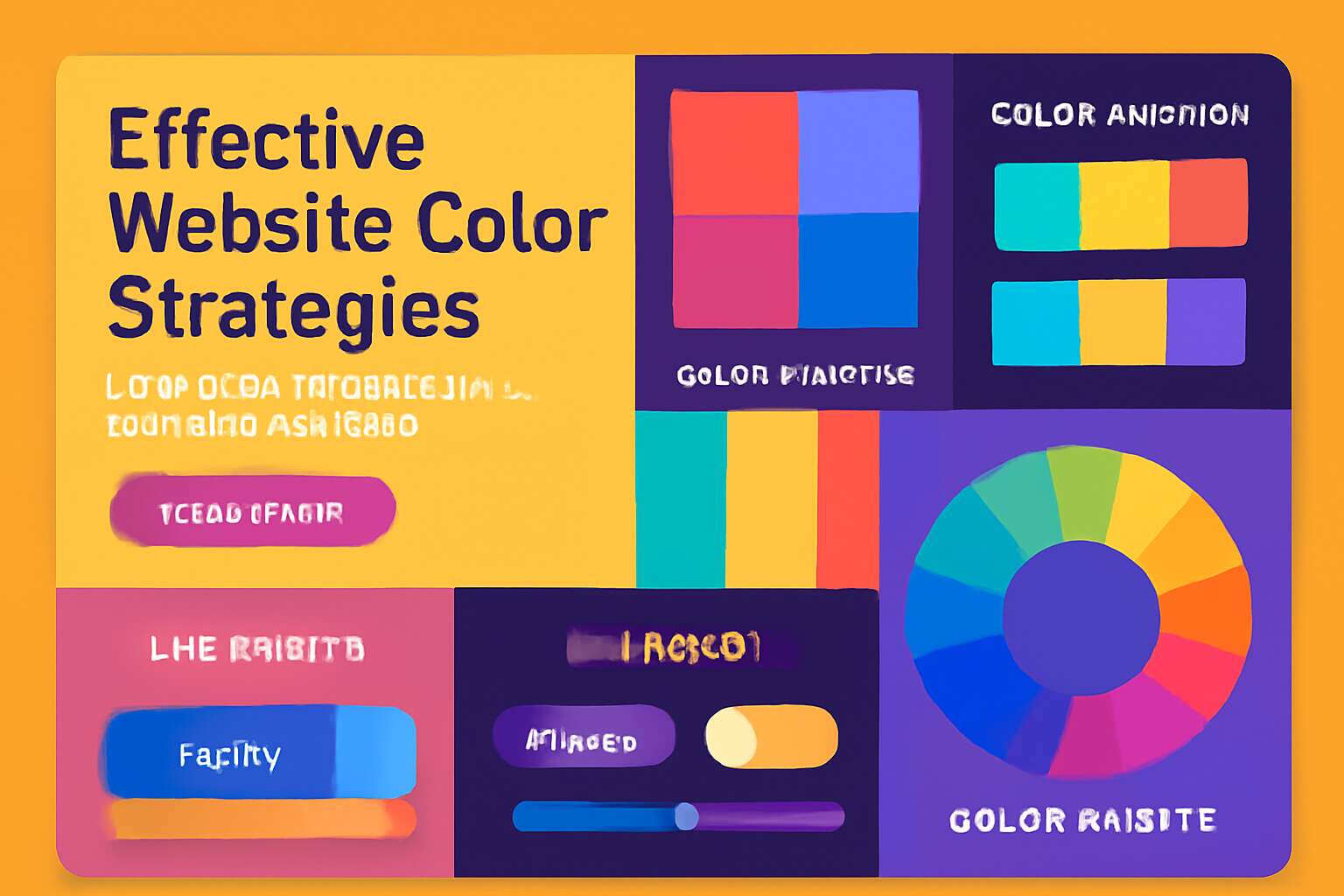
Understanding the Importance of Color in Web Design
The Psychological Impact of Colors - How different colors evoke emotions and influence user behavior
Colors are far more than mere aesthetics; they serve as silent architects of perception, shaping emotions and guiding user behavior with subtle precision. Research indicates that up to 85% of consumers cite color as a primary reason for purchasing decisions, underscoring its profound influence. In the realm of web design, understanding the psychological impact of colors becomes a vital component of effective communication. Each hue resonates differently across cultures and individuals, triggering subconscious responses that can either foster trust or evoke hesitation.
For instance, the calming blue engenders a sense of security, making it an ideal choice for financial or health-related websites. Conversely, vibrant reds stimulate urgency and excitement, perfect for call-to-action elements. When considering website color tips, it’s essential to recognize that the choice of color palette can evoke specific emotions—trust, enthusiasm, calmness—that align with your brand’s core message. The power of color lies in its ability to influence perceptions, subtly guiding visitors along their journey with intuitive cues.
Colors and Brand Identity - Aligning colors with your brand message and personality
Colors aren’t just a pretty face in web design; they’re the silent ambassadors of your brand’s personality. When selecting your palette, think of it as matchmaking—pairing the right hue with your brand message can make all the difference. After all, a luxury brand doesn’t want to be mistaken for a discount store, just as a playful startup wouldn’t suit a corporate giant. Recognizing the importance of color in web design means aligning your color choices with your brand’s core values and target audience.
To truly harness the power of website color tips, consider crafting a color strategy that reflects your brand’s essence. For example, using warm, inviting tones for a community-focused organization or sleek, minimalist shades for a tech-savvy enterprise. Remember, consistency is key—your color palette should echo across all digital touchpoints, reinforcing brand recognition. This not only elevates your visual identity but also helps build trust and loyalty among your visitors. After all, in the realm of web design, your colors tell a story—make sure it’s one that resonates loud and clear!

The Science Behind Color Perception - Visual processing and accessibility considerations
Colors are far more than surface-level choices—they’re a window into how visitors perceive your website. The science behind color perception reveals that our brains process colors instantly, often within milliseconds. This rapid visual processing shapes emotions and guides user behavior before they even read a single word. In web design, understanding this subconscious response is crucial for crafting an impactful experience. Website color tips emphasize not just aesthetics but also accessibility. For example, high contrast between text and background ensures readability for all users, including those with visual impairments. Neglecting this can alienate a significant portion of your audience and diminish trust.
- Color contrast
- Color symbolism
These elements are essential in developing a website that’s visually compelling and universally accessible, making your site’s message resonate loudly and clearly across diverse viewers. The subtle power of color can either draw visitors in or push them away—so wield it wisely in your web design strategy.”
Choosing the Right Color Scheme for Your Website
Complementary vs. Analogous Colors - Creating harmony and contrast effectively
In the realm of website color tips, selecting the perfect color scheme is akin to orchestrating a symphony where every note harmonizes to enchant the audience. Complementary colors—those opposite on the color wheel—ignite a vibrant contrast that commands attention and energizes the visual landscape. Imagine fiery reds paired with cool greens, creating a dynamic tension that beckons users to explore further. Conversely, analogous colors—those neighboring each other—offer a gentle, cohesive flow that fosters trust and serenity, essential for websites aiming to soothe or build connection.
To craft a compelling visual narrative, consider blending these approaches strategically. For instance, using analogous hues for the background and primary content, then accentuating calls-to-action with complementary pops of color, creates a balance of harmony and contrast. This technique not only enhances aesthetic appeal but also guides the user’s journey seamlessly, making your website unforgettable amidst the digital tapestry of South Africa’s diverse market. When it comes to website color tips, understanding how to harness these color relationships unlocks a new realm of creative potential.
Warm vs. Cool Colors - Setting the mood and tone of your site
Color isn’t just about making your website look pretty; it’s about setting the perfect mood and tone that resonates with your South African audience. Warm colors—think fiery reds, vibrant oranges, and sunny yellows—evoke energy, enthusiasm, and warmth. These hues are perfect if your goal is to energize visitors or create a lively, inviting atmosphere. On the flip side, cool colors like serene blues, tranquil greens, and soothing purples promote calmness, trust, and professionalism—ideal for brands that want to foster a sense of reliability and serenity.
Choosing between warm and cool colors is a fundamental step in crafting a compelling website. Consider the emotional response you want to trigger, and then align that with your brand’s personality. For example, a South African eco-tourism site might lean into lush greens and ocean blues to evoke nature and adventure. Conversely, a financial institution might prefer cooler tones to communicate stability and trustworthiness. When it comes to website color tips, balancing these hues strategically can create a visual harmony that guides users effortlessly through your content, making your site not just visually appealing but also emotionally compelling.
Color Palette Tools and Resources - Utilizing online tools for selecting color schemes
Choosing the perfect color scheme for your website might sound as thrilling as watching paint dry, but in reality, it’s the secret sauce behind a captivating user experience. When it comes to website color tips, the goal is to find hues that not only look good but also make visitors feel something—whether that’s trust, excitement, or a sense of calm. Luckily, there are a plethora of online tools to help you navigate this colorful maze. These resources can help you experiment with color palettes, ensuring your site’s hues harmonize without causing a visual headache.
For the visually inclined, tools like Adobe Color Wheel, Coolors, and Paletton are your new best friends. They allow you to generate complementary, analogous, or even triadic color schemes with just a few clicks. Want to go a step further? Consider using accessibility analyzers integrated into these tools, ensuring your color choices are inclusive and perceptible to everyone, including those with color vision deficiencies. After all, website color tips aren’t just about aesthetics—they’re about creating an accessible, memorable digital experience that resonates with your South African audience.
Color Accessibility and User Inclusivity
Designing for Color Blind Users - Ensuring readability and usability for all
Surprisingly, nearly 8% of men and 0.5% of women worldwide experience some form of color blindness, making it more common than we’d like to admit. When it comes to website color tips, ignoring accessibility isn’t just lazy—it’s a disservice to a sizable slice of your audience. Designing for color blind users isn’t about adding rainbow unicorns; it’s about ensuring clarity and usability for everyone, regardless of their visual quirks.
Effective website color tips involve more than just picking pretty shades; they require thoughtful contrast and patterns. To truly embrace user inclusivity, consider implementing high-contrast color schemes that make text pop and actions unmistakable. For example, relying solely on color cues like red for errors or green for success can leave color blind users in the dark. Instead, pairing color with meaningful icons or labels creates a more inclusive experience.
- Test your palette with online simulators to see how it appears to those with various types of color vision deficiency.
- Use tools like color contrast analyzers to ensure readability across all devices and lighting conditions.
- Incorporate design elements that convey meaning beyond color—think patterns, textures, and symbols.
Remember, the goal of website color tips isn’t just aesthetic appeal but universal accessibility. When everyone can navigate your site effortlessly, you’re not just following best practices—you’re fostering a genuinely inclusive digital environment that welcomes all users with open arms (and clear visuals).
Contrast Ratios and Text Legibility - Adhering to accessibility standards like WCAG
Color accessibility isn’t just a passing concern; it’s the cornerstone of truly inclusive website design. When considering website color tips, understanding contrast ratios becomes paramount. The Web Content Accessibility Guidelines (WCAG) recommend a minimum contrast ratio of 4.5:1 for normal text, ensuring legibility across diverse devices and lighting conditions. This isn’t merely a technicality—it’s a bridge to user inclusivity that fosters trust and engagement.
To elevate your site’s clarity, consider incorporating a variety of design elements that go beyond color alone. Patterns, textures, and icons serve as silent ambassadors of meaning, guiding users effortlessly through your digital landscape. For example, pairing a red error message with an exclamation icon or a green success notification with a checkmark enhances comprehension for everyone, including those with visual impairments.
- Utilize online contrast analyzers to verify your palette’s compliance with accessibility standards.
- Test your website color tips across multiple devices and lighting environments to ensure consistent readability.
- Balance warm and cool tones thoughtfully, creating visual harmony without sacrificing contrast.
When your website’s color scheme adheres to these principles, you’re not just ticking boxes—you’re crafting an accessible portal that invites all users to explore, interact, and connect with confidence. After all, the true magic of website color tips lies in transforming visual accessibility into a seamless, enchanting experience for everyone.
Testing Your Color Choices - Using tools to verify color accessibility
Ensuring your website’s color choices are accessible isn’t just a matter of aesthetics; it’s about reaching every potential user. Using online contrast analyzers allows you to verify that your color palette meets accessibility standards, such as those outlined in WCAG. These tools help identify areas where your contrast ratios might fall short, preventing unintentional exclusion of users with visual impairments.
Testing your website color tips across different devices and lighting environments is equally crucial. What’s clear on a desktop in a well-lit office may become unreadable on a mobile device outdoors or in low light. By simulating these scenarios, you gain a clearer picture of how inclusive your design truly is. Remember, consistent readability is the foundation of user inclusivity.
- Use contrast analyzers to check your color schemes.
- Test your website across multiple devices and lighting conditions.
- Adjust warm and cool tones to maintain harmony without sacrificing contrast.
These steps ensure that your website color tips aren’t just visually appealing but also genuinely accessible. When everyone can navigate your site with ease, you’re fostering a digital environment that invites trust, engagement, and meaningful connection—no matter who the user is.
Applying Color Strategically Across Your Website
Header and Navigation Colors - Guiding users and emphasizing key sections
Color isn’t just decoration; it’s a silent conductor guiding users through your website’s symphony. When applied strategically across headers and navigation colors, it becomes a powerful tool to emphasize key sections and foster intuitive exploration. A well-chosen hue can subtly direct attention, making important links or calls-to-action impossible to overlook without shouting. Think of your header and navigation colors as the signposts of your digital landscape—if they blend into the background, users might wander aimlessly; if they stand out with purpose, engagement soars.
To enhance usability, consider employing contrasting colors that adhere to accessible standards—after all, inclusivity is the hallmark of a truly successful website. An elegant trick is to utilize a limited palette, creating harmony while highlighting critical areas. For instance, a muted navigation bar with a vibrant accent color for active links or buttons can create visual hierarchy effortlessly. Remember, website color tips aren’t just about aesthetics—they’re about crafting an experience that feels both seamless and compelling, subtly nudging visitors toward what truly matters.
Call-to-Action (CTA) Colors - Increasing conversions through strategic color use
In the realm of digital persuasion, the colors you select for your Call-to-Action (CTA) buttons can wield remarkable influence. A splash of vibrant hue amid a muted palette isn’t just eye-catching—it’s an invitation, a magnetic pull pushing visitors toward engagement. When strategically applied, these colors don’t merely stand out; they evoke emotion and prompt action seamlessly. Think of your CTA colors as the enchanted signposts guiding users through your website’s narrative, turning passive visitors into active participants.
To amplify conversions, experiment with a palette that balances harmony and contrast. For instance, an elegant, understated background can serve as a serene canvas, while a bold, contrasting CTA button beckons with purpose. Employing a limited, intentional set of colors not only maintains visual coherence but also amplifies the impact of each element. Remember, website color tips aren’t just about aesthetic appeal—they’re about crafting an immersive experience that subtly nudges visitors toward what truly matters, transforming casual browsers into loyal customers.
Background and Text Color Combinations - Enhancing readability and visual appeal
Color choices on your website can make or break user engagement. When applying color strategically across background and text, the goal is clarity without sacrificing visual appeal. A well-balanced combination ensures readability while creating an inviting atmosphere. Bright, contrasting text on a muted background draws attention without overwhelming the senses. Conversely, softer hues can reduce eye strain, making longer browsing sessions more comfortable.
Using a limited, purposeful palette enhances cohesion and guides users naturally. Incorporating website color tips such as maintaining sufficient contrast ratios is crucial for accessibility. For example, pairing a dark header with light body text creates a clear hierarchy. Remember, the right combination not only elevates aesthetics but also ensures your message resonates. When you master applying color thoughtfully, your site becomes more than just visually appealing—it becomes a seamless experience that encourages visitors to stay longer and explore deeper.
Trends and Best Practices in Website Color Usage
Popular Color Trends in Web Design - Modern color palettes and their applications
In the swirling cosmos of web design, color trends shimmer like distant stars guiding explorers through uncharted territories. Modern color palettes embrace bold minimalism, blending muted earth tones with vibrant accents that evoke both stability and energy. These hues serve as the backbone of innovative website color tips, allowing brands to craft immersive digital worlds that resonate deeply with their audience.
Popular color trends in web design now favor gradients that mimic the shifting hues of dawn and dusk, creating visual harmony and depth. Incorporating these palettes strategically can elevate user experience, making navigation feel more intuitive and engaging. When weaving these elements into your website, remember that the right color choices can turn a simple page into a captivating journey—one that beckons visitors to linger longer and explore further. Embracing these trends with an eye for timeless application ensures your site remains both relevant and enchanting in the ever-evolving digital universe.
Maintaining Consistency and Branding - Building trust with cohesive color schemes
In the realm of digital craftsmanship, consistency isn’t just aesthetic—it’s a moral imperative. When your website color tips are rooted in a cohesive palette, you forge an unspoken trust with your audience. This visual harmony becomes a silent promise, a guarantee that every page, every element, aligns with your brand’s core identity. Such deliberate branding fosters familiarity, turning fleeting visitors into loyal advocates.
Maintaining this unity requires vigilance. It’s about understanding that every hue, from the subtle background to the bold call-to-action colors, must serve a purpose—evoking emotion, guiding attention, and reinforcing your message. A disjointed color scheme fragments this trust, like a broken mirror reflecting distorted truths. Instead, embrace a consistent color strategy that echoes your values and promises, ensuring your site remains memorable in an increasingly noisy digital landscape.
Avoiding Overuse and Clashing Colors - Ensuring a clean, professional look
In the vibrant tapestry of web design, overuse and clashing colors are the digital equivalent of loud, jarring dinner party guests—distracting and ultimately unwelcome. Achieving a clean, professional look hinges on restraint and strategic choices. When every hue is carefully curated, your website not only looks polished but also communicates clarity and purpose. Remember, a splash of color is powerful only when it serves a purpose — whether to highlight a call-to-action or guide the user seamlessly through your content.
To avoid the chaos of conflicting shades, consider employing a restrained color palette—perhaps no more than three primary hues—and reserving bold colors for important elements like buttons or links. A balanced use of warm and cool tones can create a visual rhythm that feels both harmonious and engaging. For example, pairing a calming blue with energetic orange can evoke trust while prompting action. Incorporating website color tips like these ensures your site remains elegant rather than overwhelming, fostering trust and encouraging user interaction.
- Limit your core colors to maintain visual coherence.
- Use accent hues sparingly to draw attention without cluttering the aesthetic.
- Ensure contrast ratios meet accessibility standards, preventing visual fatigue and making your site welcoming to all visitors.
In essence, avoiding overuse and clashing colors isn’t just about aesthetics—it’s a strategic move to uphold your brand’s integrity and keep visitors engaged. Properly applied, these website color tips will help your digital presence sing with sophistication, clarity, and purpose, rather than shout out in discordant cacophony.

Testing and Optimizing Your Website Colors
A/B Testing Color Variations - Measuring impact on user engagement
Testing and optimizing your website colors is often overlooked, yet it’s the secret sauce behind turning casual visitors into loyal customers. A/B testing color variations allows you to measure the real impact of your website color tips on user engagement. By presenting two different color schemes to visitors—say, a vibrant red versus a calming blue—you can gather concrete data on which hue prompts more clicks, longer visits, or conversions.
This method isn’t about guesswork; it’s about making informed decisions that align with your brand’s personality and audience preferences. Incorporate tools like heatmaps or engagement metrics to analyze how different colors influence user behavior. Remember, a subtle shift in CTA colors or header hues can dramatically improve your website’s performance. With diligent testing, your website color tips will evolve from mere aesthetics to powerful conversion catalysts.
Monitoring Analytics for Color Impact - Using data to refine color choices
In the shadowed corridors of digital design, data is the guiding light that reveals the true impact of your choices. Monitoring analytics becomes an act of revelation—unlocking the secrets behind user engagement and revealing how subtle shifts in color can sway emotions and actions. When you track metrics like bounce rates, click-throughs, or dwell time, you gain insight into which color schemes summon visitors deeper into your site’s darkened chambers.
Understanding this data transforms your approach from guesswork to mastery. For example, an increase in conversions following a change in CTA color might seem like serendipity, but it’s rooted in meticulous analysis. Using tools that visualize engagement—like heatmaps—can expose which hues beckon users or cause them to retreat. Remember, refining your website color tips isn’t a one-time ritual; it’s an ongoing dance with the shadows, where every metric guides your hand towards a more compelling design.
- Gather comprehensive engagement data over a significant period.
- Identify patterns—are certain colors leading to higher interactions?
- Adjust your color palette based on real-world user behavior and re-test.
Iterative Design and Feedback - Continuously improving your color strategy
In the realm of digital design, the shadowy corners often conceal the greatest secrets—hidden within the data that reveals how your website color tips influence user behavior. Testing and optimizing your color choices isn’t a one-and-done task; it’s an ongoing pursuit, a dance between intuition and empirical evidence. This iterative process allows you to uncover what truly resonates with your audience, transforming guesswork into a mastery rooted in real-world reactions.

Embrace feedback from your users and let it guide your adjustments. Tools like A/B testing and heatmaps illuminate which color variations captivate visitors or cause them to retreat into the shadows. For example, subtle shifts in CTA colors can dramatically increase engagement, but only if you continually refine your approach based on fresh data. Remember, the best website color tips evolve as your audience’s preferences shift—making continuous testing and refinement the heartbeat of a compelling, visually resonant site.